

How To Build a Color Palette For Your Living Room
Choosing the right colours for a living room can change the way the entire space feels. Since the living room is often used for relaxing, hosting guests, watching television, and spending time with family, its colour palette should feel comfortable, balanced, and suitable for everyday use.
Understanding How to Build a Colour Palette for Your Living Room helps you avoid random colour choices and create a space that looks planned. A good palette does not mean using many colours. It means selecting a few shades that work well together across walls, furniture, rugs, curtains, cushions, lighting, and decorative pieces.
Start With The Purpose Of The Room
Before choosing colours, think about how you use the living room. A room used mainly for family time may need warm, relaxed colours. A formal living room may look better with deeper tones, neutral walls, and structured accents. A small apartment living room may benefit from lighter shades that make the space feel open.
Match Colour With Mood
Colours influence the mood of a room. Soft beige, cream, light grey, and off-white create a calm base. Earthy tones such as terracotta, olive, tan, and brown add warmth. Blue and green can make the room feel peaceful, while mustard, rust, navy, or charcoal can create stronger visual interest.

Choose A Base Colour First
The base colour usually covers the largest area in the room. This is often the wall colour, large sofa, flooring, or a major rug. Neutral base colours are easier to work with because they allow more flexibility in furniture and décor.
Common base colours include:
-
White
-
Cream
-
Beige
-
Grey
-
Taupe
-
Soft brown
-
Warm off-white
A base colour should support the rest of the room rather than compete with it.
Use The 60-30-10 Colour Rule
The 60-30-10 rule is a simple method used in interior design. It helps divide colours in a balanced way.
60% Dominant Colour
This is the main colour of the room. It usually appears on walls, large rugs, flooring, or bigger furniture pieces.
30% Secondary Colour
This colour supports the main shade. It may appear on curtains, armchairs, side tables, cabinets, or medium-sized décor items.
10% Accent Colour
The accent colour adds contrast. It can be used in cushions, artwork, lamps, vases, throws, or small decorative items.
For example, a living room may use warm white as the dominant colour, beige as the secondary colour, and forest green as the accent colour.
Consider Existing Furniture And Flooring
Most living rooms already have fixed elements such as flooring, sofa, TV unit, curtains, or wooden furniture. These should guide your palette. If your flooring is dark wood, warm neutrals, muted greens, and beige tones may work well. If you have light tiles or marble flooring, you can use soft greys, blues, creams, or deeper accent colours.
Ignoring existing furniture can make the room look mismatched. Instead, use those pieces as reference points.
Add Texture Along With Colour
A colour palette is not only about paint shades. Texture also affects how colours appear. A beige room can look plain if every surface is flat, but it can feel rich when combined with linen curtains, a woven rug, wooden furniture, ceramic lamps, and cotton cushions.
Use Materials To Support The Palette
Wood adds warmth. Metal finishes add contrast. Glass keeps the space lighter. Fabric softens the room. Natural materials such as jute, cane, wool, and cotton can make neutral palettes feel more complete.
Test Colours In Natural And Artificial Light
Lighting changes the way colours look. A shade that appears soft in daylight may look dull or yellow under warm bulbs. A grey wall may appear cooler in a room with limited sunlight.
Always test paint samples, fabric swatches, and rug colours at different times of the day. Look at them in morning light, afternoon light, and evening artificial light before finalising the palette.

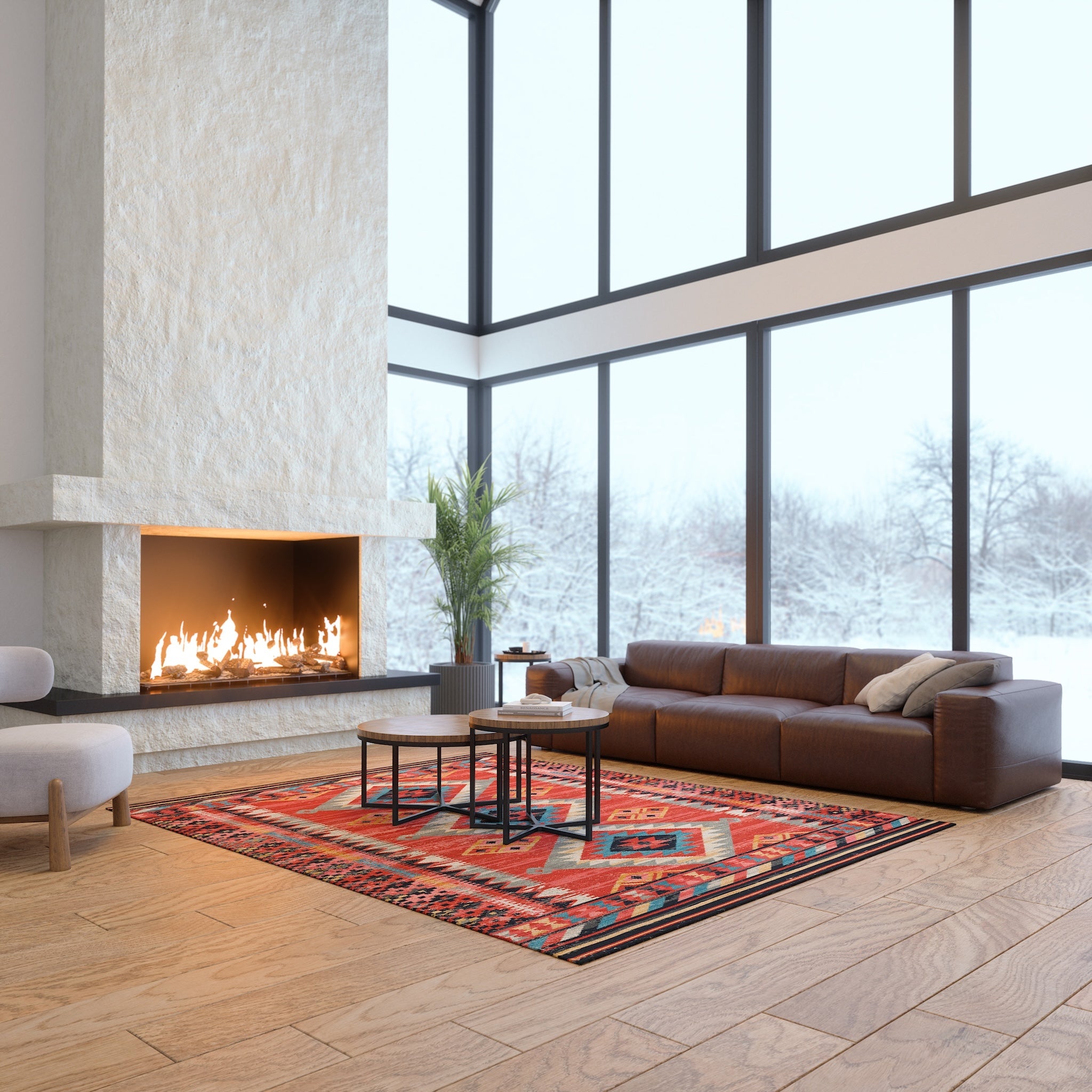
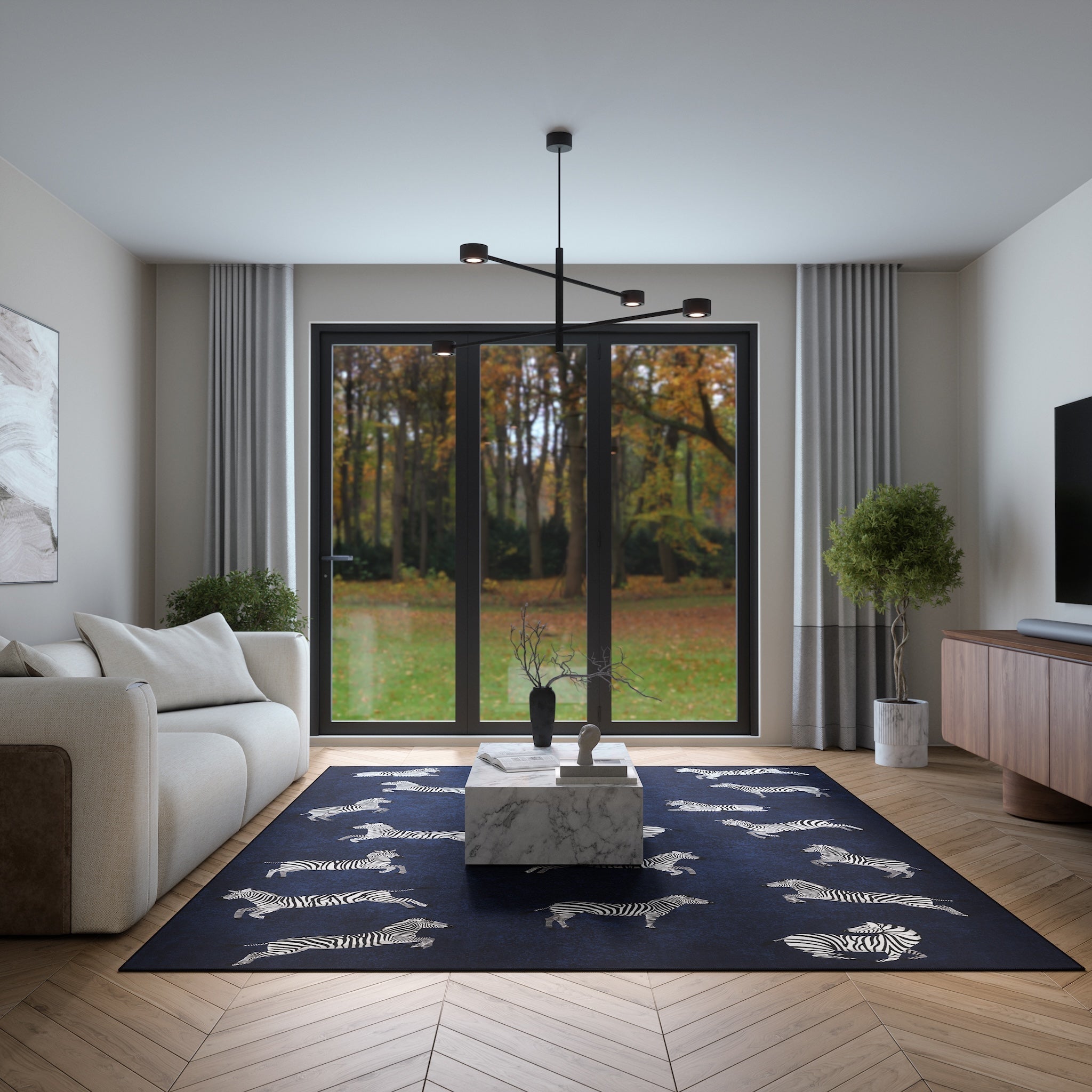
Build Around A Rug, Artwork, Or Sofa
If you are unsure where to begin, choose one key item as the starting point. This could be a patterned rug, a favourite painting, a sofa, or curtains. Pull two or three shades from that item and use them across the room.
For example, if your rug has cream, blue, and rust tones, you can use cream walls, blue cushions, and rust-coloured décor accents. This creates a connected look without making the room feel overly matched.
Avoid Using Too Many Strong Colours
A living room can quickly feel busy when too many bold colours are used together. It is better to choose one strong accent and keep the rest of the palette simple. For example, navy cushions, a rust throw, or green artwork can stand out more when placed against neutral surroundings.
Strong colours work best when repeated in small amounts. This helps the eye move around the room naturally.
Conclusion
Building a living room colour palette becomes easier when you start with the room’s purpose, existing furniture, lighting, and one clear base color. Use the 60-30-10 rule to balance dominant, secondary, and accent shades. Add texture through rugs, curtains, cushions, wood, and décor pieces to make the space feel complete.
A well-planned palette does not need to be complicated. It should make your living room feel comfortable, visually balanced, and suitable for your lifestyle.