

2027 Color of the Year: The Palette Changing Every Room
Colour has a significant influence on how a room looks and feels. It can make a compact space appear more open, bring warmth to a neutral interior, or create contrast between furniture and architectural details. As interior preferences evolve, annual colour forecasts provide useful inspiration for homeowners, decorators, and designers planning updates.
2027 Color of the Year: The Palette Changing Every Room reflects a broader interest in adaptable colours that can work across different interior styles. Rather than treating one shade as a rule for decorating, homeowners can use colour forecasts as a starting point for selecting paint, furniture, textiles, wallpaper, and accessories.
The key is understanding how to introduce these colours in a way that complements the existing character of a room.
What Does the 2027 Colour Palette Mean for Interiors?
Colour trends often develop in response to changes in architecture, fashion, materials, and everyday living. For 2027, interior colour palettes are expected to continue moving towards shades that feel comfortable, practical, and easy to combine.
Warm neutrals, nature-inspired greens, muted blues, earthy reds, and deeper accent shades can all play different roles within a home. Instead of relying on a single dominant colour, rooms can use several related shades to create depth.
This approach also makes it easier to update an interior without replacing everything at once.
Think Beyond a Single Colour
A Colour of the Year does not need to cover every wall.
The selected shade can appear through a painted feature wall, wallpaper, an upholstered chair, curtains, cushions, rugs, or smaller decorative pieces. Using the colour selectively allows it to complement the room rather than dominate it.
A broader palette also provides more flexibility when working with furniture and finishes that are already in place.

Bring the 2027 Colour Palette Into the Living Room
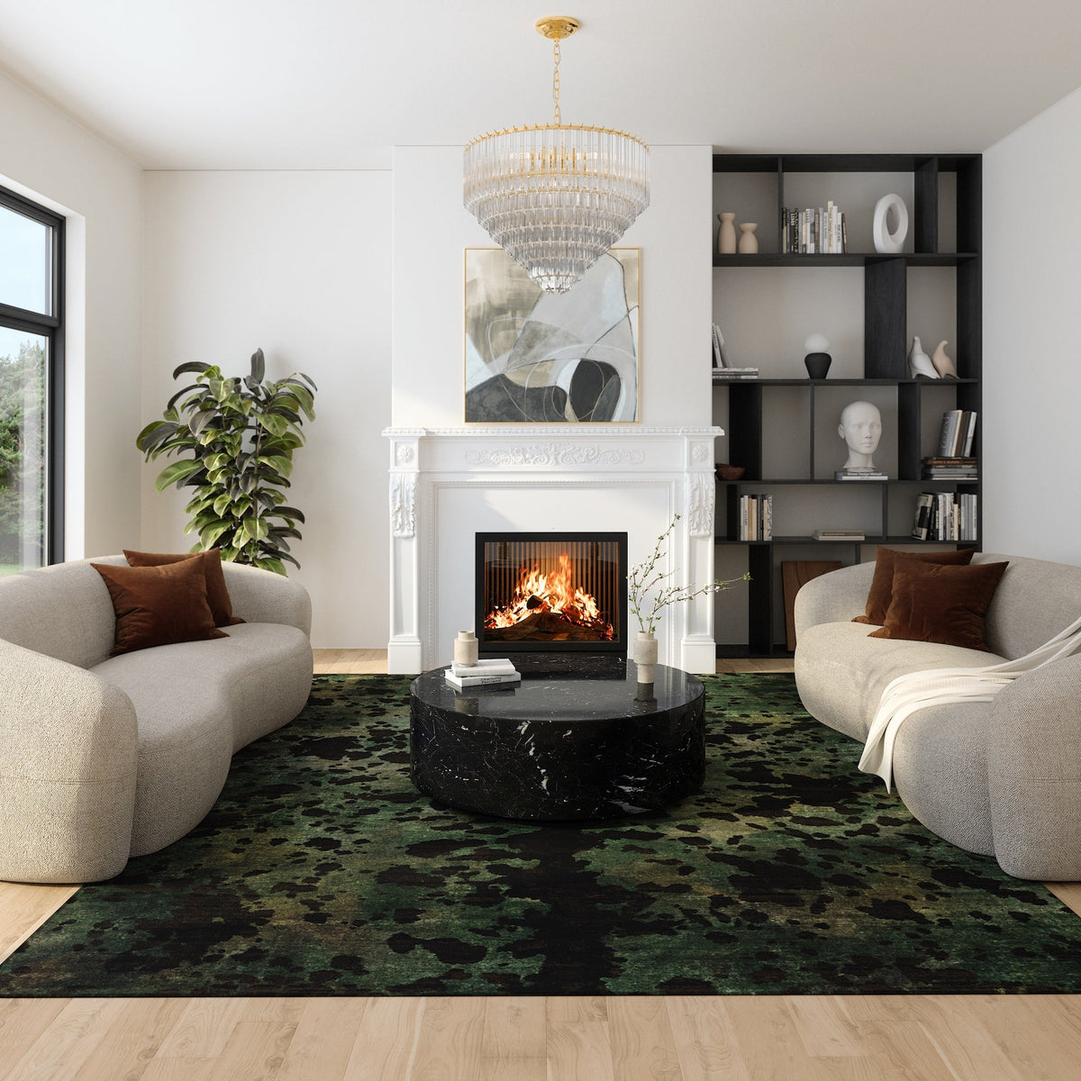
Living rooms usually contain several visual elements, including seating, flooring, lighting, artwork, and window treatments. Any new colour should therefore connect with the existing scheme.
One practical approach is to begin with a neutral foundation and introduce the chosen colour through one or two noticeable elements. A painted wall, large rug, or pair of curtains can establish the main tone.
Smaller accessories can then repeat related shades throughout the room.
Balance Strong Colours With Neutral Elements
If you choose a deeper or more saturated colour, balance it with quieter tones.
Cream, beige, soft grey, warm white, and natural wood can give stronger shades enough visual space. This prevents multiple colours from competing for attention and helps furniture remain clearly defined.
Create a Restful Bedroom Colour Scheme
Bedrooms generally benefit from a more restrained approach to colour.
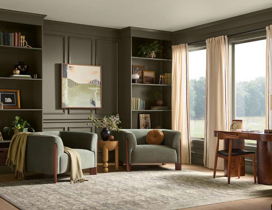
Muted greens, soft blues, warm neutrals, and subdued earthy shades can create a comfortable backdrop for bedding and furniture. Rather than using several unrelated colours, select two or three tones that work together.
For example, a deeper wall colour can be paired with lighter bedding and natural wood furniture. Alternatively, neutral walls can provide a background for coloured upholstery, curtains, or patterned wallpaper.
Use Textiles to Introduce Colour
Textiles provide a simple way to explore a new colour palette without making permanent changes.
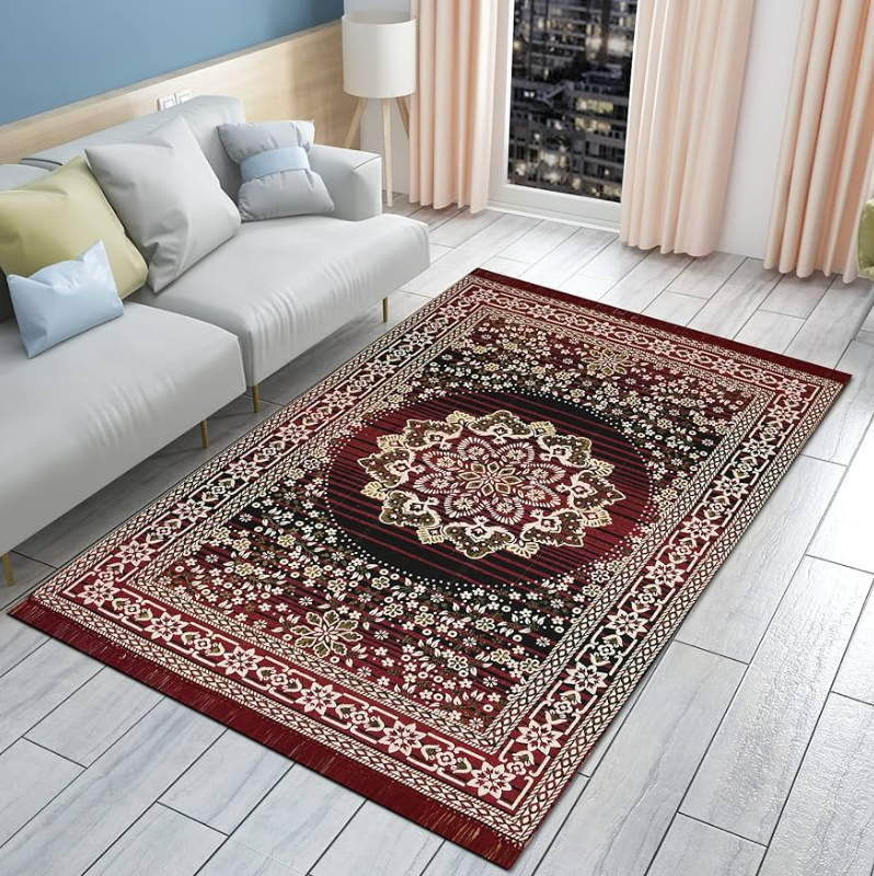
Bed linen, throws, cushions, curtains, and rugs can introduce different shades in controlled amounts. They can also be changed more easily than wall finishes if your preferences change later.
Update the Kitchen and Dining Area
Colour can be particularly effective in kitchens and dining spaces because these rooms often contain large areas of cabinetry, worktops, flooring, and furniture.
Rather than replacing existing cabinets, consider introducing colour through walls, dining chairs, pendant lighting, window treatments, or decorative objects.
Muted greens and earthy shades can pair naturally with timber finishes, while deeper blues may work alongside white, grey, or stone surfaces.
Consider Existing Materials
Before adding a new colour, look closely at permanent materials in the room.
Stone worktops, wooden floors, tiles, and metal fixtures usually have undertones that affect how another colour appears beside them. Comparing samples directly against these materials can help you avoid combinations that look disconnected.
Experiment With Colour in Smaller Spaces
Hallways, powder rooms, home offices, and reading areas provide useful places to experiment.
Because these areas are often smaller, they can support colours that might feel too strong across a large living room. A deeper shade on the walls, patterned wallpaper, or contrasting trim can give a small space a more defined identity.
Small rooms also require fewer materials, making them practical places to test a colour before using it elsewhere.
Pay Attention to Natural and Artificial Light
The same colour can appear very different depending on lighting conditions.
A room with strong daylight may reveal cooler undertones, while a north-facing or darker room can make certain colours appear deeper. Artificial lighting can also alter how paint, wallpaper, and fabrics look in the evening.
Always test colour samples in the actual room before making a final decision.
Observe Samples Throughout the Day
Place large samples on different walls and check them at several times of day.
Morning sunlight, afternoon light, and evening lamps can each change the appearance of a colour. Observing these differences can help you choose a shade that works consistently in the space.
Combine New Colours With Existing Furniture
Following a colour trend does not require replacing furniture.
Instead, identify the dominant colours already present in sofas, tables, flooring, cabinetry, and artwork. Choose shades from the 2027 palette that complement these elements.
Repeating a colour two or three times around a room can also create visual continuity without making the scheme feel overly coordinated.
Final Thoughts
2027 Color of the Year: The Palette Changing Every Room can serve as inspiration rather than a fixed decorating formula. The most effective colour choices are those that respond to the room's lighting, proportions, materials, furniture, and everyday use.
Whether you introduce a new shade through paint, wallpaper, textiles, furniture, or small accessories, consider how it relates to what is already in the space. Testing samples and working with a limited palette can help create an interior that feels balanced, practical, and visually connected.